Graham Reid | | 9 min read

Paul McCartney perhaps spoke for his
generation when he recalled the thrill of buying a new record as a
teenager and, while taking it home, sitting in the bus pouring over
the cover photo and liner notes, scanning them for clues.
The covers of subsequent Beatle albums
also had that effect on another generation, and their covers were
emblematic of the era: their debut album Please Please Me of '63 was
shot quickly in the EMI building one afternoon, four years later the
artist Peter Blake was assembling the elaborate cover for Sgt.
Pepper's which came in a gatefold sleeve.
The golden age of album cover art and
design was the late Sixties/early Seventies when there was ambitious
music – and a monied audience – which demanded complimentary
packaging.
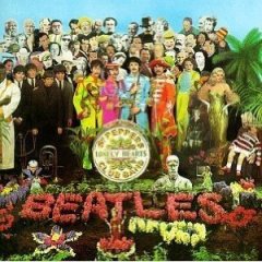 In the wake of the Sgt. Pepper's in '67
came rock-operas (The Who's Tommy in '69 kicking off a wave),
prog-rock (King Crimson's In Court of the Crimson King in '69 in a
striking painting by Barry Godber) and concept albums (Rick Wakeman,
the sometime keyboard player in Yes launching a concept-album career
with The Six Wives of Henry VIII in '73)
Work by artists such as Storm
Thorgerson (who designed for Pink Floyd) and Roger Dean (whose
otherworld paintings for Yes and Greenslade are a clear influence on
James Cameron's Avatar film) became as identifiable as the musicians
they designed for.
 Labels such as Vertigo (Uriah Heep,
Juicy Lucy, Gentle Giant) presented many albums in covers which
opened out. The gatefold sleeve became the industry standard in the
early Seventies.
Designers played with the possibilites
of album covers: Jethro Tull's Stand Up ('69) had pop up figures of
the band on the inside. Their Thick as a Brick ('72) took the form of
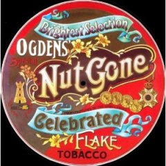
a tabloid-sized newspaper and – as with the Small Faces Ogden's Nut
Gone Flake ('68) which came in a round cover with foldouts and
replicated a tobacco tin – was impossible to store in record shops
or at home.
 The Wailers' Catch A Fire ('73) was a
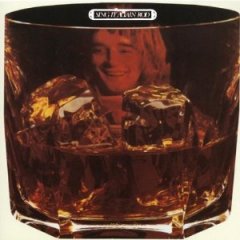
cigarette lighter with a flip-top and Rod Stewart's Sing It Again Rod
of the same year was, equally appropriately, shaped as a glass of
Scotch on the rocks.
There were covers like school desks
etched with graffiti (Alice Cooper's Schools Out in '72), wallets
(Cooper again, Billion Dollar Babies, '73) and Genesis' concept album
The Lamb Lies Down on Broadway ('74) came in a gatefold with a
narrative on the inner pages and a separate booklet of lyrics.
In New Zealand some covers by
international artists were reprinted in cheaper versions (Sgt.
Pepper's in the standard card envelope, no pop-up Jethro Tull, the
Rolling Stones' Their Satanic Majesties Request of '67 without the 3D
cover photo) but local artists and labels were often ambitious and
inventive within the constraints of the small market.
 Farmyard's self-titled debut album of
the early Seventies came in a plastic bag, and there were numerous
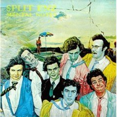
gatefold sleeves (Split Enz' Mental Notes in a cover painting by Phil
Judd which is now in the Te Papa collection, John Hanlon's Garden
Fresh, The Rumour's concept album Land of New Vigour and Zeal among
them).
As recent albums by Tim Guy, An Emerald
City (their Circa Scaria which also came as gatefold vinyl was very
prog-rock/Roger Dean) and Juliagrace (slightly larger than CD with a
colourful booklet) have proven, the art of cover design is still very
much alive.
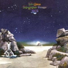 The 2010 Yes four-CD and DVD set Keys
to Ascension comes in a sturdy six-panel fold-out cover with a
booklet and, again, art by Roger Dean. Not quite the same as that
Dean gatefold for their Tales from Topographic Oceans record of 73
however.
Conventional wisdom says innovative
cover art and design was lost during the CD generation because of the
limitations of the jewel case and the paltry size of compact discs.
Not so, says Auckland's Andrew B. White
who has designed more than 600 CD covers for albums, singles, special
projects and promo discs, among them covers for Greg Johnson, Tha
Feelstyle, Jan Hellriegel, the Nature's Best collections (in multiple
formats and sizes) and Greg Fleming.
 White began his design career in the
Flying Nun era of the 80s (Able Tasmans, David Kilgour) and
consequently has worked in multiple formats.
“The good thing about the CD was it
was just a shrink-down of an LP cover. The most difficult was
converting to cassette format which stayed around a lot longer than
LPs, in fact as recently as the early 2000s we would still do a major
release of a cassette.
“But you had to reformat a square
design to a diagonal.”
As someone who grew up with cassettes at
home, White says he always felt short-changed by cassette covers so
when he started designing for them he would have foldouts for liner
notes and information just as on the album version.
And he argues the CD format actually offers more possibilities for design than the vinyl album.
“The booklet enabled you to do more
because you had pages, as opposed to an insert which was two sided.
Sometimes a booklet can feel more substantial and read more
coherently than an insert.
“With a CD you can have a booklet
with maybe up to five panels on each side which folds out in a long
form, you can fold that out again so it is essentially an A4 poster
. . . You have more options to experiment with layout.”
With CD you can also change the colour
of the plastic tray, go to the cardboard digi-pak format or the more
substantial super-jewel with the rounded corners which are less prone
to being damaged. It is possible to design without using plastic at
all. And with the disc itself there are possibilities for colour,
patterns and even textural feel.
 Some CD cover designs are exceptional:
last year's album Skeletal Lamping by the Georgia band Of Montreal
opens out into an elaborate multi-panel floral-style design, and
American rockers Clutch offered an equally handsome fold-out with an
A3 poster insert in a cut-out slip cover.
Locally CD cover designs range from the
simple “exquisite corpse” multi-panel by Tono and the Finance
Company on their Fragile Thing EP (black'n'white drawings on a
fold-out card) through White's design for Greg Fleming's Taken (a
full colour 24-page booklet) to the origami buffalo with the limited
edition version of Phoenix Foundation's album of the same name.
 Loop's release of the CD/DVD package
for Fly My Pretties' A Story was an object lesson in what is possible
in packaging and design: an embossed cardboard sleeve contained the
two separate digi-paks (each with an embossed cover) and the 10-page
booklet of acknowledgements, a synopsis of the concept, photographs
and credits.
Mikee Tucker, manager and creative
director at Loop Recordings, says they have always lavished attention
on their DVD and CD releases.
“I guess that comes from us being a
magazine at the beginning and appreciating design, and doing books of
art with New Zealand artists and designers. We've always had a soft
spot for creativity, and not just music but also films, art and
design, the creative culture as a whole.
“With every Loop release we believe
packaging is a key aspect. Our market is discerning and Fly My
Pretties' audience is a bit older and appreciates that packaging.
“For Barnaby [Weir, of Fly My
Pretties] and I, Fly My Pretties is not just another release, it is a
special something that comes along once every three or four years and
we might as well do it right. That was as expensive as it looks.
“We did the design to emphasise the
story that Dick [Weir] and Barnaby had written took it through the
disc and DVD.”
Sponsorship offset some Pretties
production costs but Tucker says they still took a hit on the price
which others might not wear – yet the CD/DVD set, which retailed at
the standard price for a double-disc set – is almost certified
platinum (15000 sales).
The digital-download age has created a
different era again. White recently did a survey through Facebook
asking if people who bought music digitally cared if they got liner
notes: 90% said no, they just wanted the music.
“If they really want to know who
played on track five they will probably Google it. The other camp
however absolutely wanted liner notes. They'll probably buy the vinyl
version and get mp3 download and the CD as well, because the CD might
have bonus tracks or a DVD.”
However even White, who is so used to
designing for CD he doesn't compare to vinyl albums as much,
acknowledges sometimes the difference between the two formats is
obvious. Size does make a difference.
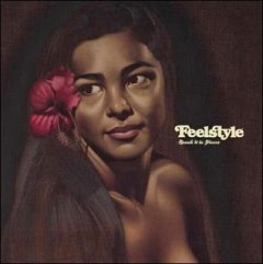
“Tha Feelstyle cover was one, the LP
had a much better impact.”
The original cover painting was
rather flat so it was photoshopped to bring it out the colours and
was printed with an overgloss.
“The CD is okay but, side by side, the LP is streets ahead.”
White also notes when people talk
nostalgically about Storm Thorgerson's Pink Floyd covers that he had
the advantage of using the LP size for a powerful image which, when
re-sized down, are much less striking: “His is an art form that
really works in that large format. If he'd started out when it was
CD-only they may not have had the same iconic impact.”
 Bad design or art won't stop people
buying if they like the music, but striking design can bring in those
wavering. The small comeback of the vinyl format has also seen an
interesting change says White who last year designed the limited
edition vinyl version of Jan Hellriegel's All Grown Up. The seduction
of a high quality album cover still works.
“You used to pay $35 for a CD and an
LP was $40. But for that you get two pieces of vinyl in a gatefold
sleeve and nice printing and I think, 'I'd rather have the record
thanks'. You can't put your LP into iTunes but the smart people today
include codes or you'll get the CD as well. It's no cost to them.
“I pick things up and think, 'That's great. Ah, what the hell, I'll buy it'.”
Want to read more about album cover art (and some very bad or hilarious examples)? The go here.
And want something about even older records? Then go here.
And musical instruments even older still? Then go here.
Andrew B White's website is here.



Andrew - Jan 17, 2011
Great article. I am currently looking at cover concepts for a project of mine, which has become a painstaking process as I aim to create a static image that will be effective across several mediums - so I can appreciate what Andrew B White is saying above. I feel that although cover art is essentially a packaging component and in some way removed from the musical experience, it is usually the initial point of contact with the listener. For an artist such as myself who has no momentum or reputation to speak of I think this of the upmost importance when posting music on blogs etc. "If the quality of artwork is poor, then what's the music gonna be like?" - That's the philosophy I'm working with. In that respect I think cover art is more important than it's ever been.
SaveBlair - Jan 20, 2011
I miss the whole tactile experience with the buying process - sifting through vinyl bins and walking out with something tangible that you felt really meant something (and the packaging was a big part of that). Remember the story of Keith bumping into Mick at the train station in Dartford in the early '60s - Jagger had Chuck Berry & Howling Wolf records tucked under his arm & whats more they were imports? what would happen now - "hey man lets see whats on your iPod"?
Savepost a comment