Graham Reid | | 5 min read
Jackie McLean: Right Now
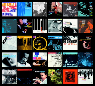
As you read this, the Blue Note record label is celebrating it's 75th anniversary. The label synonymous with classic jazz -- which went some way to defining the way people understood jazz in the Fifties and Sixties -- has been going since 1939 when its founder Alfred Lion recorded pianists Albert Ammons and Meade Lux Lewis in a New York studio.
At the end of that year Lion was joined by his childhood friend and photographer Francis Wolff -- both emigres from Germany who grew up together in Berlin -- and together they shaped how people heard and saw jazz.
With studio engineer Rudy Van Gelder, the sound of Blue Note jazz was a key element, but just as important was the look of the records when, with the arrival of LPs and the idea of illustrated covers, the photos of Wolff were matched by the design genius of Reid Miles in the Fifties.
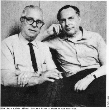 As Ruth Lion, Alfred's wife, would recall, "Reid created hundreds of covers that became a virtual trademark".
The Blue Note story is not without its low points -- Lion selling it up in '67 and leaving to retire in Mexico, the label almost going out of business in the early Eighties until the revival under Michael Cuscuna who kept up a reissue programme, then the arrival of Bruce Lundvall (interviewed here) who steered it to commercial success with the likes of artists such as Norah Jones and Bobby McFerrin who appealed to non-jazz audiences .
Today with its catalogue, expanding under new president Don Was (whose production credits include the Rolling Stones, Bob Dylan, Iggy Pop and others) the label looks set to diversify even further.
Although it is still recording new jazz artists, like trumpeter Takuya Kuroda.
To celebrate its 75th anniversary the label is currently the subject of a major exhibition at the Grammy Museum in Los Angeles and over the following year 100 of its iconic records will be remastered and reissued on vinyl. First out of the gate are Art Blakey's Free For All, John Coltrane's Blue Train, Eric Dolphy's Out to Lunch (an Essential Elsewhere album, see here), Wayne Shorter's Speak No Evil and Larry Young's Unity.
For a full list and further information on all 100 remastered vinyl reissues see here. These albums should be available in New Zealand around April 25.
But for this column we shine the spotlight on some of the classic covers on the label, many of which have been copied, parodied and paid homage to down the decades.
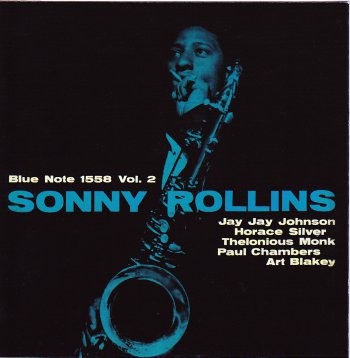 * Artist Sonny Rollins. Released 1957. Cover design Harold Feinstein. Photo Francis Wolff. A much copied style idea as witnessed by this recent cover/homage.
Photographer Feinstein -- who went on to become an acclaimed war photographer in Korea and has had many solo exhibitions in the past few decades -- was one of the few other than Reid who designed covers in the early years. But his work became part of the signature style.
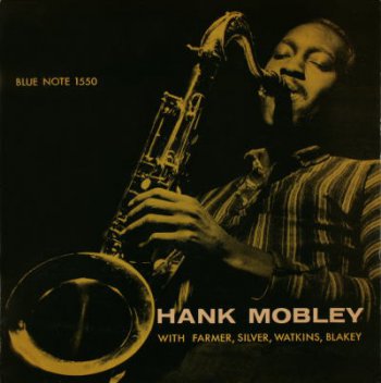
* Artist Hank Mobley Quintet. Released 1957. Cover design Harold Feinstein. Photo Francis Wolff. Another variation on the same theme and which inspired not dissimilar covers for albums by Lee Morgan, Dexter Gordon and Clifford Brown (among many others) which -- along with the style and the Van Gelder sound -- gave the label a sense of continuity and thematic consistency. As labels like ECM would do in the following decades, Blue Note had a look as much as a sound.
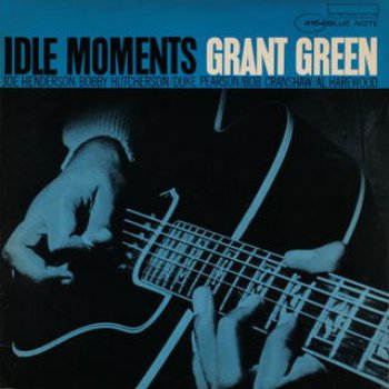
* Artist Grant Green. Released 1963. Cover design Reid Miles. Photo Francis Wolff. One of Miles' frequently employed stylistic trademarks was the tight cropping of Wolff's photos, many of which were taken in the studio. On some covers the top of the artist's head might be cropped off or part of the portrait blown up to fill the frame. The emotional effect was the buyer/fan felt close to the artist . . . although equally, Miles was adept at making photos work when the artist was at a distance. See below.
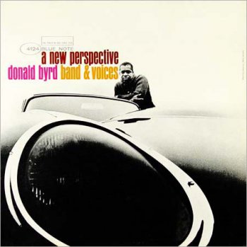
* Artist Donald Byrd. Released 1963. Cover design and photo Reid Miles. A classic cover where the title was paralleled by the photo angle, and one which also breathed style. Cars were a popular Miles theme. Other covers which employed them were Jimmy Smith's I'm Movin' On (1963), Joyride by Stanley Turrentine ('65) and A Caddy for Daddy by Hank Mobley ('65). Cars were cool and the American art form of jazz found its parallel in the American automobile.
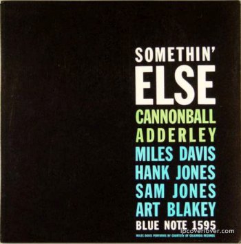 * Artist Cannonball Adderley. Released 1958. Cover design Reid Miles. Even from very early on Miles experimented with typeset and bold faces to create a striking and distinctive design. He used this style on covers for Freddie Hubbard, Kenny Dorham, Dexter Gordon and others where he combined typography with photographs as in the examples below. This Miles style was another much copied innovation which Blue Note introduced to album cover art.
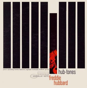
* Artist Freddie Hubbard. Released 1962. Design Reid Miles. Photo Francis Wolff. Over a number of covers at this time -- while also experimenting with cars, close cropping and shots Wolff captured in the studio -- Miles played with such striking images of bold strips and smaller images dropped into the design. Albums by The 3 Sounds, Tina Brooks, Don Wilkerson and others deployed strips to create vibrant abstract designs.
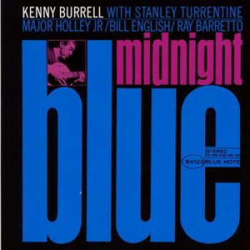
* Artist Kenny Burrell. Released 1963. Design Reid Miles. Photo Francis Wolff. One of the label's most famous and much copied designs. Among artists who have paid homage to this striking design is Barney Bubbles for Elvis Costello on his Almost Blue album of '81 where Bubbles mimicked the lettering and the use of a photo of the artist. Miles used it again for sleeves on albums by Dexter Gordon, Sony Rollins, Stanley Turrentine and others, but always with a distinctive variation to make them unique.
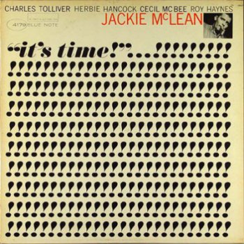 * Artist Jackie McLean. Released 1964. Design Reid Miles. Photo Francis Wolff. The triumph of repetition and the power of an exclamation mark made this stand out in stores, although few have tried to copy or pay tribute to it. Perhaps because it is so singular. Miles used repetition in a variety of ways (the same photo cropped and run three times parallel down the sleeve, the title repeated) but the next year he went one step further towards minimalism for another classic cover (see below).
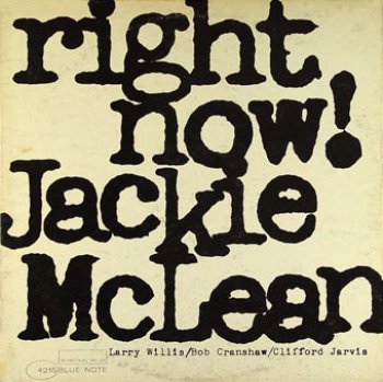 * Artist Jackie McLean. Released 1965. Design Reid Miles. Not just a classic design but one of Blue Note's great albums (see here). And Miles' style here has come down to us on albums by XTC (their Go2 cover of '78 was pure typography also) and many others, especially during the punk/New Wave era. It almost became an anti-cover statement in later hands, a rejection of the idea of the artist having to be on the cover.
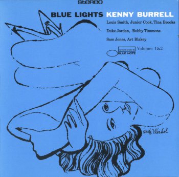
* Artist Kenny Burrell. Released 1958. Design Reid Miles. Illustration Andy Warhol. Although Miles and Wolff were responsible for most of the label's covers in its classic era, occasionally illustrators like the young Warhol -- then in his late 20s -- were commissioned. He did a drawing for a cover for a Johnny Griffin album and an earlier one for Burrell also.
So despite his critics, Warhol could actually draw. It's just that later he chose not to.
** For more on Blue Note artists historic and contemporary start your reading and listening at Elsewhere right here.
.



post a comment